2023. 3. 10. 14:48ㆍ카테고리 없음
1. 군집 알고리즘
2. k-평균
3. 주성분 분석
1. 군집 알고리즘
1. 타깃을 모르는 비지도 학습
📌 비지도 학습 : 타깃이 없을 때, 사용하는 머신러닝 알고리즘
2. 과일 사진 데이터 준비하기
💻 넘파이에서 파일 읽기 위해 코랩으로 다운로드
!wget https://bit.ly/fruits_300_data -O fruits_300.npy
💻 넘파이와 맷플롯립 패키지 임포트
import numpy as np
import matplotlib.pyplot as plt
📍 load() 메서드 : 넘파이에서 npy 파일 로드
fruits = np.load('fruits_300.npy')
💻 fruits 타입 확인 및 배열의 크기 확인
type(fruits)
>>> numpy.ndarray

print(fruits.shape)
>>> (300, 100, 100)
💻 첫 번째 이미지의 첫 번째 행
print(fruits[0, 0, :])
>>> [  1   1   1   1   1   1   1   1   1   1   1   1   1   1   1   1   2   1
       2   2   2   2   2   2   1   1   1   1   1   1   1   1   2   3   2   1
       2   1   1   1   1   2   1   3   2   1   3   1   4   1   2   5   5   5
      19 148 192 117  28   1   1   2   1   4   1   1   3   1   1   1   1   1
       2   2   1   1   1   1   1   1   1   1   1   1   1   1   1   1   1   1
       1   1   1   1   1   1   1   1   1   1]
📍 imshow() 함수 : 맷플롯립의 넘파이 배열로 저장된 이미지 쉽게 그려내는 함수
plt.imshow(fruits[0], cmap='gray')
plt.show()

🔎 0에 가까울수록 검게 나오고, 높은 값은 밝게 나옴
📍 cmap=gray_r : 색깔 반전
plt.imshow(fruits[0], cmap='gray_r')
plt.show()
👨🏻💻 만약에 이렇게 생성한 이미지를 정말정말 저장하고 싶다면?
import numpy as np
from PIL import Image

im = Image.fromarray(fruits[0])
im.save("fruits_1.jpeg")
📍 subplots() : 여러 개의 그래프를 배열처럼 쌓을 수 있도록 도와줌
fig, axs = plt.subplots(1, 2) # matplot꼬 한 행을 두 칸으로 쪼개겠다
axs[0].imshow(fruits[100], cmap='gray_r')
axs[1].imshow(fruits[200], cmap='gray_r')
plt.show()
fig, axs = plt.subplots(1, 3)
axs[0].imshow(fruits[100], cmap='gray_r')
axs[1].imshow(fruits[200], cmap='gray_r')
axs[2].imshow(fruits[0], cmap='gray_r')
plt.show()
3. 픽셀값 분석하기
💻 100x100 이미지를 펼쳐서 길이가 10,000인 1차원 배열로 만들기
apple = fruits[0:100].reshape(-1, 100*100)
pineapple = fruits[100:200].reshape(-1, 100*100)
banana = fruits[200:300].reshape(-1, 100*100)
💻 apple의 shape 확인
print(apple.shape)
>>> (100, 10000)
🔎 개당 10000개의 데이터가 있는 100개의 사과..
💻 사과의 샘플 픽셀 평균값 구하기
print(apple.mean(axis=1))
>>> [ 88.3346  97.9249  87.3709  98.3703  92.8705  82.6439  94.4244  95.5999
      90.681   81.6226  87.0578  95.0745  93.8416  87.017   97.5078  87.2019
      88.9827 100.9158  92.7823 100.9184 104.9854  88.674   99.5643  97.2495
      94.1179  92.1935  95.1671  93.3322 102.8967  94.6695  90.5285  89.0744
      97.7641  97.2938 100.7564  90.5236 100.2542  85.8452  96.4615  97.1492
      90.711  102.3193  87.1629  89.8751  86.7327  86.3991  95.2865  89.1709
      96.8163  91.6604  96.1065  99.6829  94.9718  87.4812  89.2596  89.5268
      93.799   97.3983  87.151   97.825  103.22    94.4239  83.6657  83.5159
     102.8453  87.0379  91.2742 100.4848  93.8388  90.8568  97.4616  97.5022
      82.446   87.1789  96.9206  90.3135  90.565   97.6538  98.0919  93.6252
      87.3867  84.7073  89.1135  86.7646  88.7301  86.643   96.7323  97.2604
      81.9424  87.1687  97.2066  83.4712  95.9781  91.8096  98.4086 100.7823
     101.556  100.7027  91.6098  88.8976]
🔎 axis=1은 열을 따라 계산하라는 의미를 내포
💻 히스토그램으로 사과, 파인애플, 바나나 시각화
plt.hist(np.mean(apple, axis=1), alpha=0.8)
plt.hist(np.mean(pineapple, axis=1), alpha=0.8)
plt.hist(np.mean(banana, axis=1), alpha=0.8)
plt.legend(['apple', 'pineapple', 'banana'])
plt.show()
🔎 사과와 파인애플이 은근 겹치네..?
💻 픽셀 각각의 평균을 내서 봐보자
fig, axs = plt.subplots(1, 3, figsize=(20, 5))
axs[0].bar(range(10000), np.mean(apple, axis=0))
axs[1].bar(range(10000), np.mean(pineapple, axis=0))
axs[2].bar(range(10000), np.mean(banana, axis=0))
plt.show()
🔎 사과는 양 옆이 높고, 파인애플은 비슷, 바나나는 가운데가 솟아있는 형태!
💻 상단의 그래프를 바탕으로 이미지처럼 출력하여 보기
apple_mean = np.mean(apple, axis=0).reshape(100, 100)
pineapple_mean = np.mean(pineapple, axis=0).reshape(100, 100)
banana_mean = np.mean(banana, axis=0).reshape(100, 100)

fig, axs = plt.subplots(1, 3, figsize=(20, 5))
axs[0].imshow(apple_mean, cmap='gray_r')
axs[1].imshow(pineapple_mean, cmap='gray_r')
axs[2].imshow(banana_mean, cmap='gray_r')
plt.show()
4. 평균값과 가까운 사진 고르기
💻 모든 샘플에서 apple_mean 뺀 절댓값의 평균 구하기
abs_diff = np.abs(fruits - apple_mean)
abs_mean = np.mean(abs_diff, axis=(1,2)) # 1번 축과 2번 축을 추가 # 데이터 구조 만든거양
print(abs_mean.shape)
>>> (300,)
📍 np.argsort() : 작은 것에서 큰 순서대로 나열한 배열의 인덱스 반환
💻 가장 작은 순서대로 100개 고르기
apple_index = np.argsort(abs_mean)[:100]
fig, axs = plt.subplots(10, 10, figsize=(10,10))
for i in range(10):
    for j in range(10):
        axs[i, j].imshow(fruits[apple_index[i*10 + j]], cmap='gray_r')
        axs[i, j].axis('off') # 축을 꺼달라
plt.show()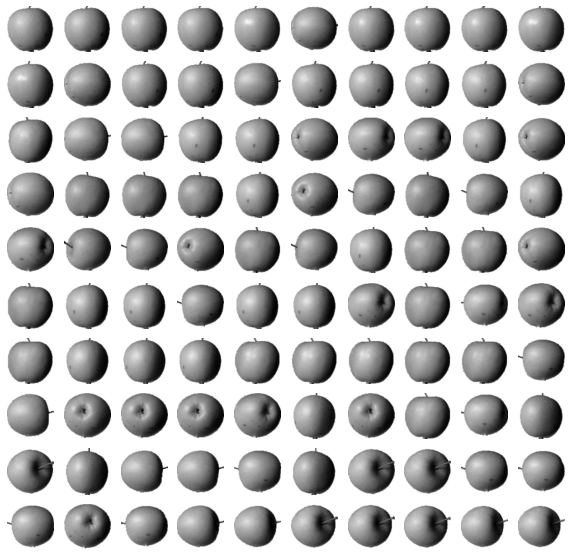
2. k-평균
1. k-평균 알고리즘 소개
📌 작동 방식
- 무작위로 k개의 클러스터 중심 정하기
- 각 샘플에서 가장 가까운 클러스터 중심을 찾아 해당 클러스터의 샘플로 지정
- 클러스터에 속한 샘플의 평균값으로 클러스터 중심 변경
- 클러스터 중심에 변화가 없을때까지 2번째 단계로 돌아가 반복
2. KMeans 클래스
💻 데이터 다운로드
!wget https://bit.ly/fruits_300_data -O fruits_300.npy
💻 2차원 배열로 크기 변환
import numpy as np

fruits = np.load('fruits_300.npy')
fruits_2d = fruits.reshape(-1, 100*100)

print(fruits_2d.shape)
>>> (300, 10000)
📍 KMeans 클래스 중 n_clusters 사용
from sklearn.cluster import KMeans

km = KMeans(n_clusters=3, random_state=42)
km.fit(fruits_2d)
📍 labels_ 속성 : 군집된 결과가 저장된 곳
print(km.labels_)
>>> [2 2 2 2 2 0 2 2 2 2 2 2 2 2 2 2 2 2 0 2 2 2 2 2 2 2 2 2 2 2 2 2 2 2 2 2 2
     2 2 2 2 2 0 2 0 2 2 2 2 2 2 2 0 2 2 2 2 2 2 2 2 2 0 0 2 2 2 2 2 2 2 2 0 2
     2 2 2 2 2 2 2 2 2 2 2 2 2 2 2 2 2 0 2 2 2 2 2 2 2 2 0 0 0 0 0 0 0 0 0 0 0
     0 0 0 0 0 0 0 0 0 0 0 0 0 0 0 0 0 0 0 0 0 0 0 0 0 0 0 0 0 0 0 0 0 0 0 0 0
     0 0 0 0 0 0 0 0 0 0 0 0 0 0 0 0 0 0 0 0 0 0 0 0 0 0 0 0 0 0 0 0 0 0 0 0 0
     0 0 0 0 0 0 0 0 0 0 0 0 0 0 0 1 1 1 1 1 1 1 1 1 1 1 1 1 1 1 1 1 1 1 1 1 1
     1 1 1 1 1 1 1 1 1 0 1 1 1 1 1 1 1 1 1 1 1 1 1 1 1 1 1 1 1 1 1 1 1 1 1 1 1
     1 1 1 1 1 1 1 1 1 1 1 1 1 1 0 1 1 1 1 1 1 1 1 1 1 1 1 1 1 1 1 1 1 1 1 1 1
     1 1 1 1]
🔎 n_clusters=3으로 지정했기 때문에 labels_배열의 값은 0,1,2 중 하나
💻 레이블 0, 1, 2로 모은 샘플의 개수 확인
print(np.unique(km.labels_, return_counts=True))
>>> (array([0, 1, 2], dtype=int32), array([111,  98,  91]))
💻 각 클러스터가 어떤 이미지를 나타냈는지 그림으르 출력하는 함수 생성
import matplotlib.pyplot as plt

def draw_fruits(arr, ratio=1):
    n = len(arr)    # n은 샘플 개수
    rows = int(np.ceil(n/10)) # ceil은 올림
    cols = n if rows < 2 else 10
    fig, axs = plt.subplots(rows, cols,
                            figsize=(cols*ratio, rows*ratio), squeeze=False)
    for i in range(rows):
        for j in range(cols):
            if i*10 + j < n:    # n 개까지만
                axs[i, j].imshow(arr[i*10 + j], cmap='gray_r')
            axs[i, j].axis('off')
    plt.show()
💻 label 값 추출하기
draw_fruits(fruits[km.labels_==0])
draw_fruits(fruits[km.labels_==1])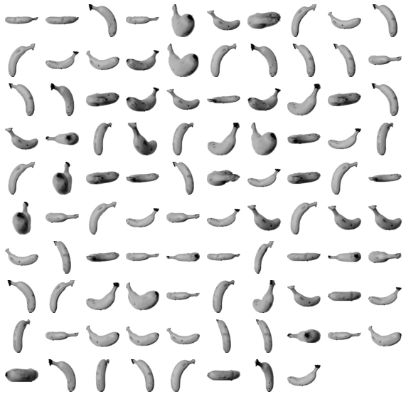
draw_fruits(fruits[km.labels_==2])
🔎 사과하고 바나나는 완벽하게 구분했는데, 파인애플 분류는 사과와 바나나가 섞여 있군
3. 클러스터 중심
📍 cluster_centers_ 속성 : KMeans 클래스가 최종적으로 찾은 클러스터 중심이 저장되어 있는 곳
km.cluster_centers_
>>> array([[1.        , 1.        , 1.        , ..., 1.        , 1.        ,
            1.        ],
           [1.10204082, 1.07142857, 1.10204082, ..., 1.        , 1.        ,
            1.        ],
           [1.01098901, 1.01098901, 1.01098901, ..., 1.        , 1.        ,
            1.        ]])

km.cluster_centers_.shape
>>> (3, 10000)👨🏻💻 항상 데이터를 확인하고 변수를 확인하는 걸 습관화하세요
draw_fruits(km.cluster_centers_.reshape(-1, 100, 100), ratio=3)
📍 transform() 메서드 : KMeans 클래스의 훈련 데이터 샘플에서 클러스터 중심까지 거리로 변환해주는 메서드
print(km.transform(fruits_2d[100:101]))
>>> [[3393.8136117  8837.37750892 5267.70439881]]
🔎 transform() 메서드는 fit()과 마찬가지로 2차원 배열을 기대함
3가지 숫자 중 가장 낮은 숫자는 중심까지의 거리가 제일 작은 것이다.
따라서 해당 샘플은 0번째 레이블과 제일 가깝다고 볼 수 있다.
💻 100번째 데이터 예측 및 확인
print(km.predict(fruits_2d[100:101]))
>>> [0]

draw_fruits(fruits[100:101])
📍 n_iter_ : 알고리즘이 반복한 횟수 저장되어 있는 속성
print(km.n_iter_)
>>> 4
4. 최적의 k 찾기
📌 엘보우 방법
inertia = []
for k in range(2, 7):
    km = KMeans(n_clusters=k, random_state=42)
    km.fit(fruits_2d)
    inertia.append(km.inertia_)

plt.plot(range(2, 7), inertia) # 2에서 6까지 다섯 번 훈련
plt.xlabel('k')
plt.ylabel('inertia')
plt.show()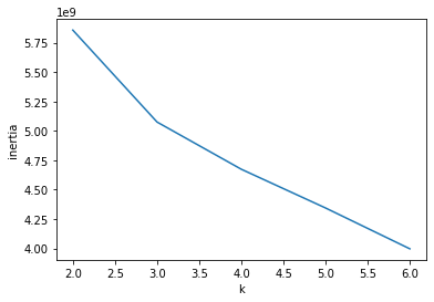
🔎 최적의 클러스트 개수는 꺽여있는 3이라고 할 수 있다.
3. 주성분 분석
1. PCA 클래스
💻 과일 사진 데이터 다운로드 하여 넘파이 배열로 적재
!wget https://bit.ly/fruits_300_data -O fruits_300.npy
import numpy as np

fruits = np.load('fruits_300.npy')
fruits_2d = fruits.reshape(-1, 100*100)
📌 PCA 클래스 : 사이킷런 decomposition 모듈 아래에 있으며, 주성분 분석 알고리즘 제공
from sklearn.decomposition import PCA

pca = PCA(n_components=50)
pca.fit(fruits_2d)
🔎 n_components 매개변수에 주성분의 개수 지정
비지도 학습이기 때문에 fit() 메서드에 타깃값 제공 하지 않음
📍 components_ : PCA 클래스가 찾은 주성분 저장되어 있음
print(pca.components_.shape)
>>> (50, 10000)
💻 draw_fruits 함수 다시 정의 (위와 동일) 후 주성분 그림으로 나타내기
import matplotlib.pyplot as plt

def draw_fruits(arr, ratio=1):
    n = len(arr)    # n은 샘플 개수입니다
    # 한 줄에 10개씩 이미지를 그립니다. 샘플 개수를 10으로 나누어 전체 행 개수를 계산합니다.
    rows = int(np.ceil(n/10))
    # 행이 1개 이면 열 개수는 샘플 개수입니다. 그렇지 않으면 10개입니다.
    cols = n if rows < 2 else 10
    fig, axs = plt.subplots(rows, cols,
                            figsize=(cols*ratio, rows*ratio), squeeze=False)
    for i in range(rows):
        for j in range(cols):
            if i*10 + j < n:    # n 개까지만 그립니다.
                axs[i, j].imshow(arr[i*10 + j], cmap='gray_r')
            axs[i, j].axis('off')
    plt.show()
draw_fruits(pca.components_.reshape(-1, 100, 100))
💻 transform() 메서드 사용해 원본 데이터의 차원 축소
print(fruits_2d.shape)
>>> (300, 10000)

fruits_pca = pca.transform(fruits_2d)
print(fruits_pca.shape)
>>> (300, 50)
2. 원본 데이터 재구성
🔎 앞에서 10,000개의 특성을 50개로 줄였기 때문에 복원함에 있어, 어느정도의 손실이 발생할 수 밖에 없음
📍 inverse_trasnform() : 원본 데이터 복원
fruits_inverse = pca.inverse_transform(fruits_pca)
print(fruits_inverse.shape)
>>> (300, 10000)
💻 데이터를 100 x 100 크기로 바꾸고, 100개씩 나누어 출력
fruits_reconstruct = fruits_inverse.reshape(-1, 100, 100)
for start in [0, 100, 200]:
    draw_fruits(fruits_reconstruct[start:start+100])
    print("\n")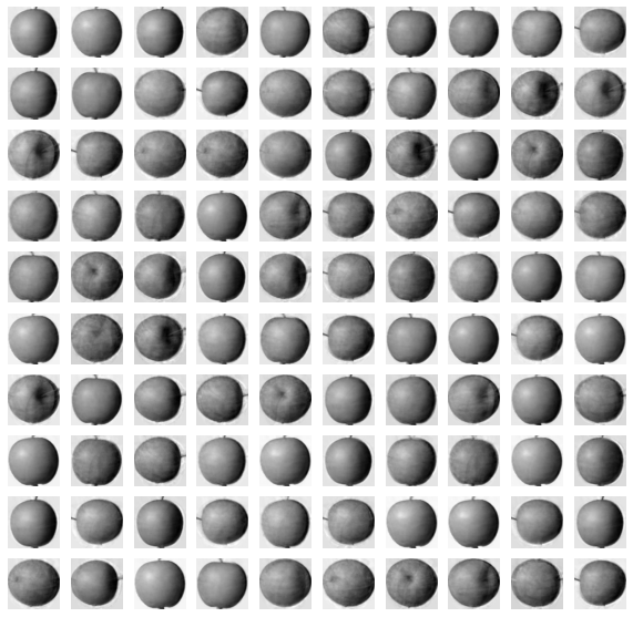


3. 설명된 분산
📌 설명된 분산 : 주성분이 원본 데이터의 분산을 얼마나 잘 나타내는지 기록한 값
📍 explained_variance_ratio_ : 주성분의 설명된 분산 비율이 기록되어 있는 PCA 클래스
print(np.sum(pca.explained_variance_ratio_))
>>> 0.9215603753848458
🔎 92%가 넘는 분산을 유지하고 있음을 확인할 수 있다.
💻 설명된 분산을 그래프로 출력
plt.plot(pca.explained_variance_ratio_)
4. 다른 알고리즘과 함께 사용하기
💻 로지스틱 회귀 모델 사용
# 객체 생성
from sklearn.linear_model import LogisticRegression
lr = LogisticRegression()

# 타깃값 생성
target = np.array([0] * 100 + [1] * 100 + [2] * 100)

# 교차 검증
from sklearn.model_selection import cross_validate

scores = cross_validate(lr, fruits_2d, target)
print(np.mean(scores['test_score']))
print(np.mean(scores['fit_time']))	# 소요시간
>>> 0.9966666666666667
>>> 1.5067562103271483
🔎 교차 검증의 점수는 0.997 정도로 매우 높음. 특성이 10,000개나 되기 때문에 300개의 샘플에서는 금방 과대적합된 모델을 만들기 쉬움
💻 PCA로 축소한 fruits_pca와 test_score
scores = cross_validate(lr, fruits_pca, target)
print(np.mean(scores['test_score']))
print(np.mean(scores['fit_time']))
>>> 1.0
0.03554835319519043
🔎 시간을 비교해보면 PCA로 산정된 값이 훨씬 빠른 것을 확인할 수 있음
💻 설명된 분산의 50%에 달하는 주성분 찾기
pca = PCA(n_components=0.5)
pca.fit(fruits_2d)

print(pca.n_components_)
>>> 2
💻 이 모델로 원본 데이터 변환
fruits_pca = pca.transform(fruits_2d)
print(fruits_pca.shape)
>>> (300, 2)
💻 교차 검증 결과 확인
scores = cross_validate(lr, fruits_pca, target)
print(np.mean(scores['test_score']))
print(np.mean(scores['fit_time']))
>>> 0.9933333333333334
>>> 0.021050548553466795
💻 차원 축소된 데이터 사용하여 k-평균 알고리즘으로 클러스터 찾기
from sklearn.cluster import KMeans

km = KMeans(n_clusters=3, random_state=42)
km.fit(fruits_pca)

print(np.unique(km.labels_, return_counts=True))
>>> (array([0, 1, 2], dtype=int32), array([110,  99,  91]))
💻 KMeans가 찾은 레이블을 활용하여 과일 이미지 출력
for label in range(0, 3):
    draw_fruits(fruits[km.labels_ == label])
    print("\n")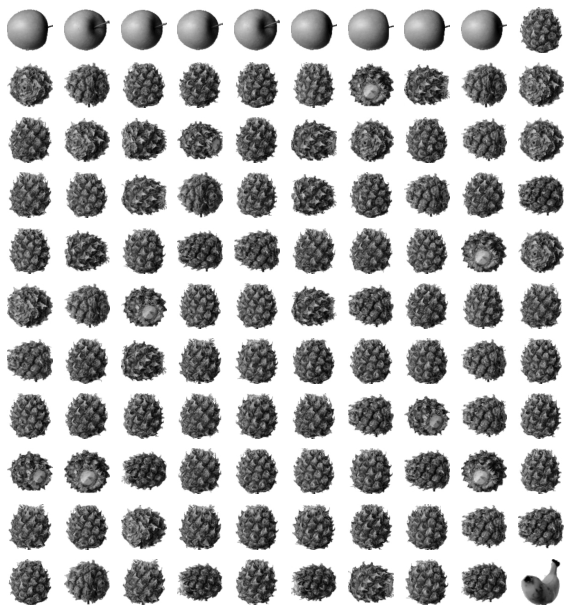


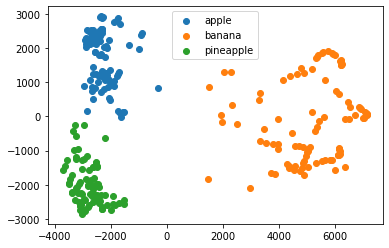
💻 클러스트 별로 나누어 산점도 생성
for label in range(0, 3):
    data = fruits_pca[km.labels_ == label]
    plt.scatter(data[:,0], data[:,1])
plt.legend(['apple', 'banana', 'pineapple'])
plt.show()